Backstory
SysdigMonitor is an application used by DevOps (development and IT operations) engineers to monitor and troubleshoot their production and staging environments.
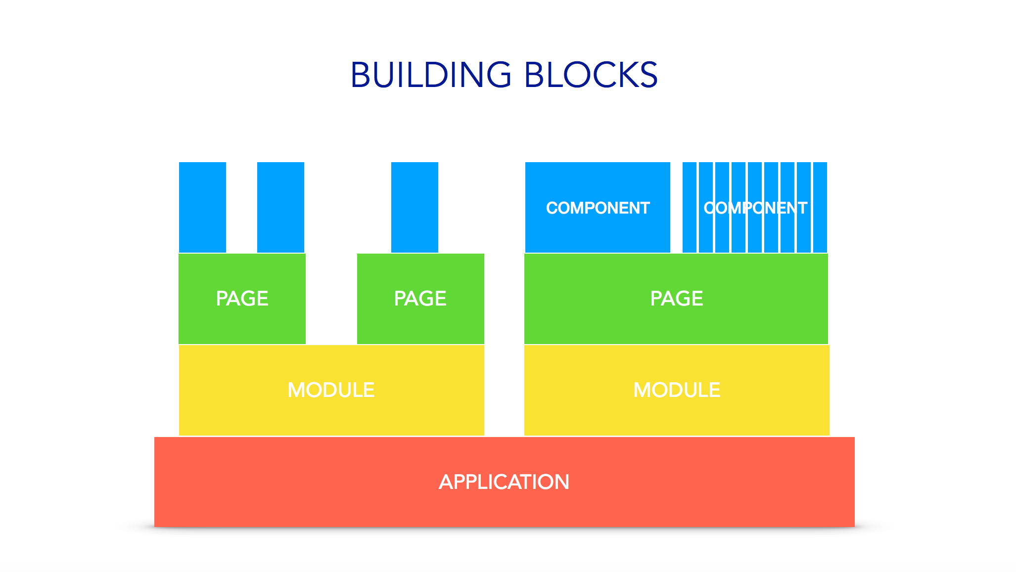
I joined Sysdig as the first full-time designer in June 2016. The UI was built without scaling and maintainability in mind, and designed, quote the engineering team, "by engineers, for engineers." On the customer side, many users called the app "overwhelming", "too complicated" and not worth the time to learn. In order to create more engaged and less frustrated users, increase our perceived value against competitors, and serve as a catalyst to forming a design system, I decided in August 2017 to start redesigning the app.
The Journey Begins
With the help of an old UI analysis documentation and a mentor, I spent a day deconstructing the Sysdig UI to create design principles. Based on our user and their varied emotional states in the app, I decided:
1. Color is for data.
2. Too much data is no data at all.
3. Let every object in the system breathe.
Market Analysis
To better understand the expectations of users, I looked interfaces from frequently mentioned products such as Data Dog, New Relic, Grafana, and Kibana (part of the ELK Stack). The biggest insight was moving the navigation to the left would not be a surprise--in fact, it would allow the data to be first stopped in the upper left, and give a user more vertical height to see their data. In addition, the idea of a dark UI came up, similar to Grafana and text editors.
Wireframes
Persona Development
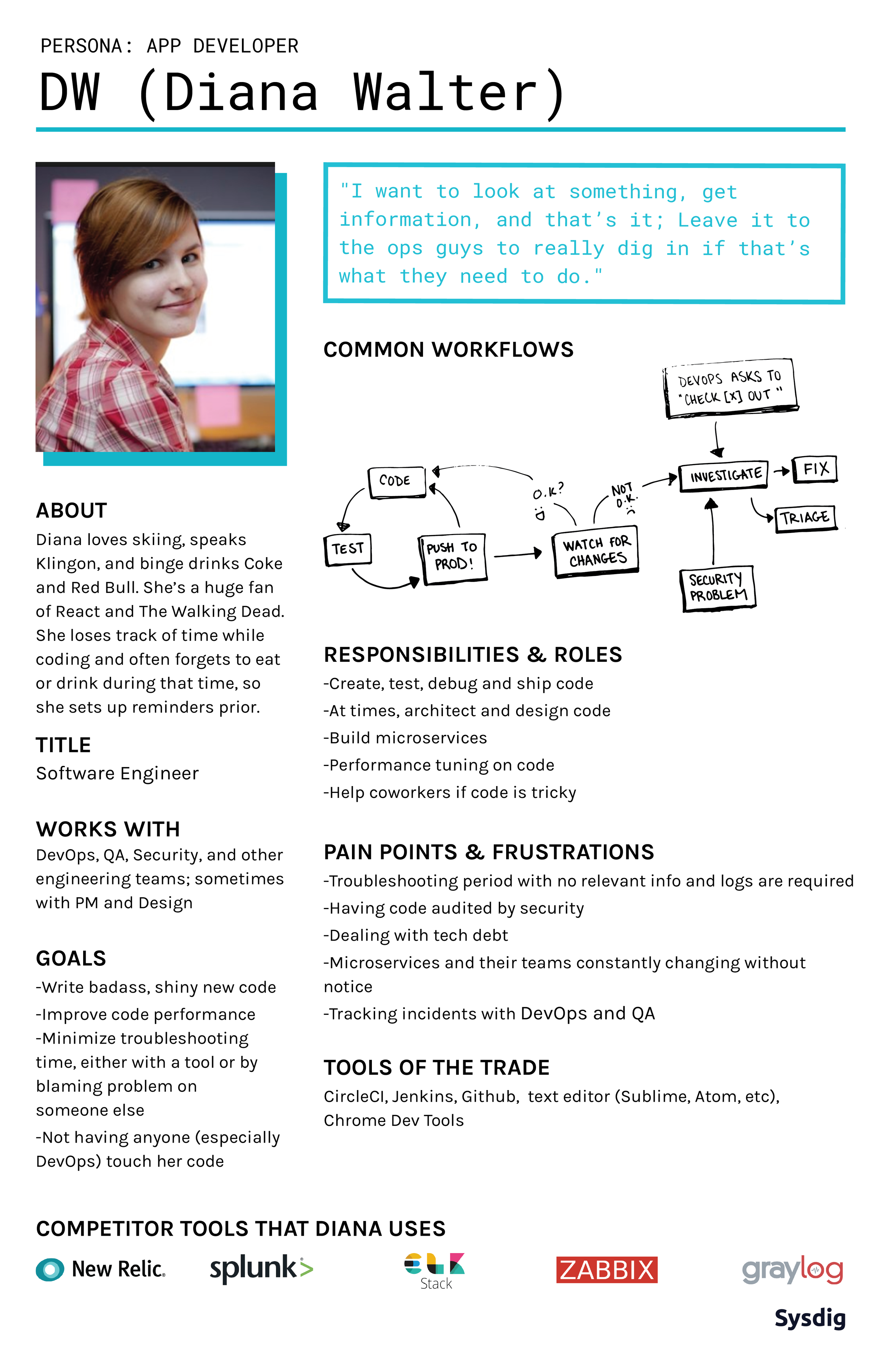
Practicing user-centered design, I interviewed 4 DevOps and 6 Application Developers in order to better understand their daily habits, pain points, and how we could better their day-to-day jobs, and then created posters so the company could unify on who we are designing, building, and selling to.
Getting Buy In
I used a low fidelity prototype to pitch the value of a framework to product management and to display a vision of what a visually consistent and cleaned up application could look like. It was approved unanimously and a formal effort towards the redesign began.
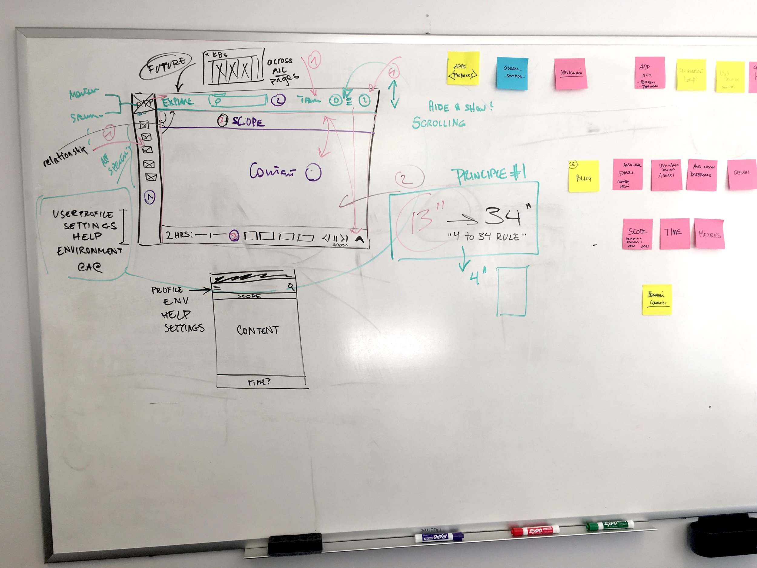
Low fidelity flow of application with old navigation
Evangelizing UX
Because the company never had a design framework before, I wanted to present a clear and digestible process that we could adapt. This was my first large venture into explaining design systems and pitching to stakeholders that what we were doing was useful to not only design, but product, engineering, marketing, and sales. When presented to stakeholders at the CEO, it received a highly positive response.
Example of "dark UI" that did not make it into first round of development
Visual Design
True to my design principles, I relied on a few cool tones to let line graphs and severity colors (typically warm-colored) stand out. Roboto was selected from one of three fonts for its performance, readability across SaSS and on-premise customers, and wide style selection.
Research and Testing
In order to have some quantitative feedback on the redesign and onboard new team members into the user research process, I scripted and moderated five usability studies in a 24 hour period (In retrospect, I do not recommend unless you want to be drained at the end of the day). Between a left-hand versus top navigation, the left side navigation was the majority favorite in design, meaning the initial team selector in the upper right corner would have to move. As a surprise insight, many users confused a gear icon as the application-level settings as opposed to settings of smaller entities such as a dashboard or panel. This inspired the transition to a "more" icon (three vertical dots) instead of a gear to increase clarity.
Top navigation and left hand navigation in Invision
Iteration and Final Design
The final prototype was rather robust for engineering, so the design was adjusted to include the "c-frame," or module header, left-hand navigation, and footer (time).
Post-Release and Introspection
Since its company debut, the redesign has received a steady stream of positive feedback, including:
“It looks like it was designed this time.” -Backend Engineer
“It’s so clean...I’m motivated to refactor the app now.” -Frontend Engineer
“I have to admit...It looks pretty sweet.” -CEO
This redesign was also adapted into our other products, Sysdig Secure and Inspect.
While the design is far from perfect, I’m proud of the work I started and finished and the morale boost the entire company received. If I had to do it again, I would’ve fought harder to keep the team selector in the top right corner (visibility in app vs. common patterns), get checkboxes for the table components on the first MVP (could we have waited three weeks for that much more value?) and done user research much earlier in the process to not have to rushed it at the end.
