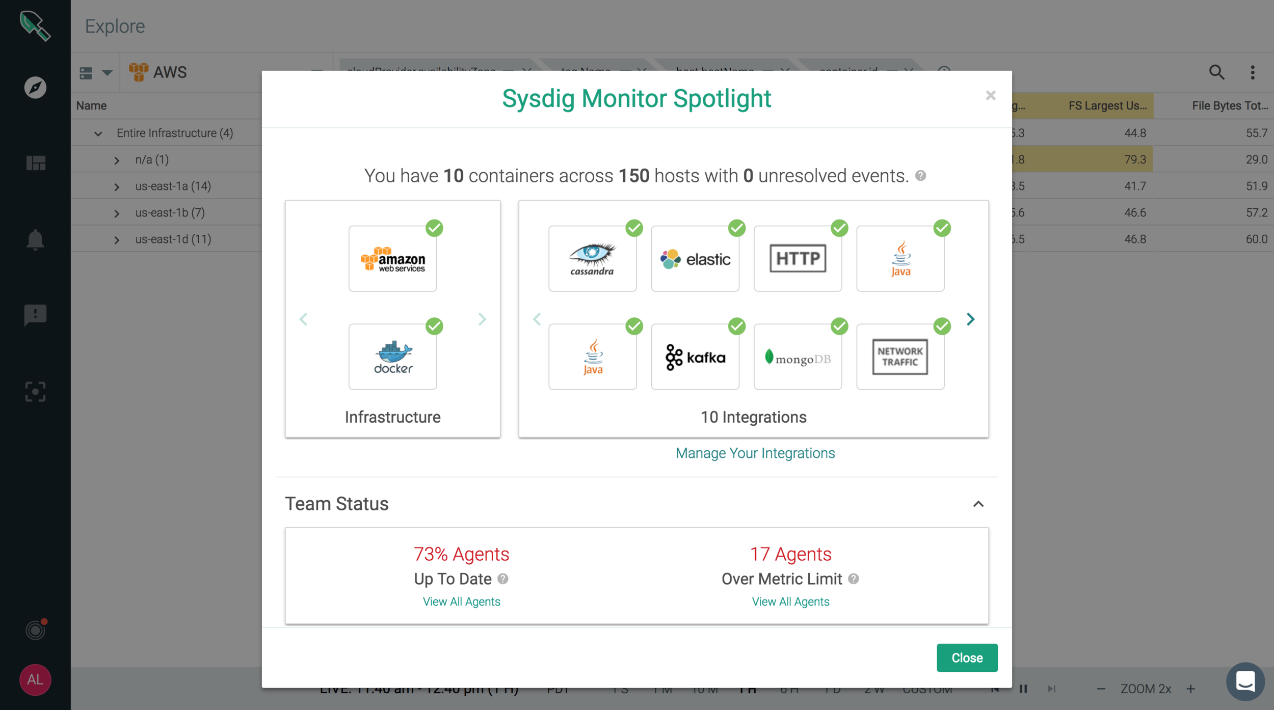
Onboarding and Spotlight feature for a first time user
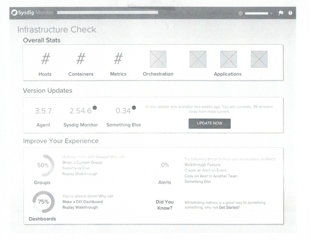
Sysdig Spotlight is a feature that offers DevOps engineers visibility of their infrastructure for effortless troubleshooting. To learn more about it, check out this post that I wrote on Sysdig's blog.
The Problem
Spotlight arose from both customer and internal pain points.
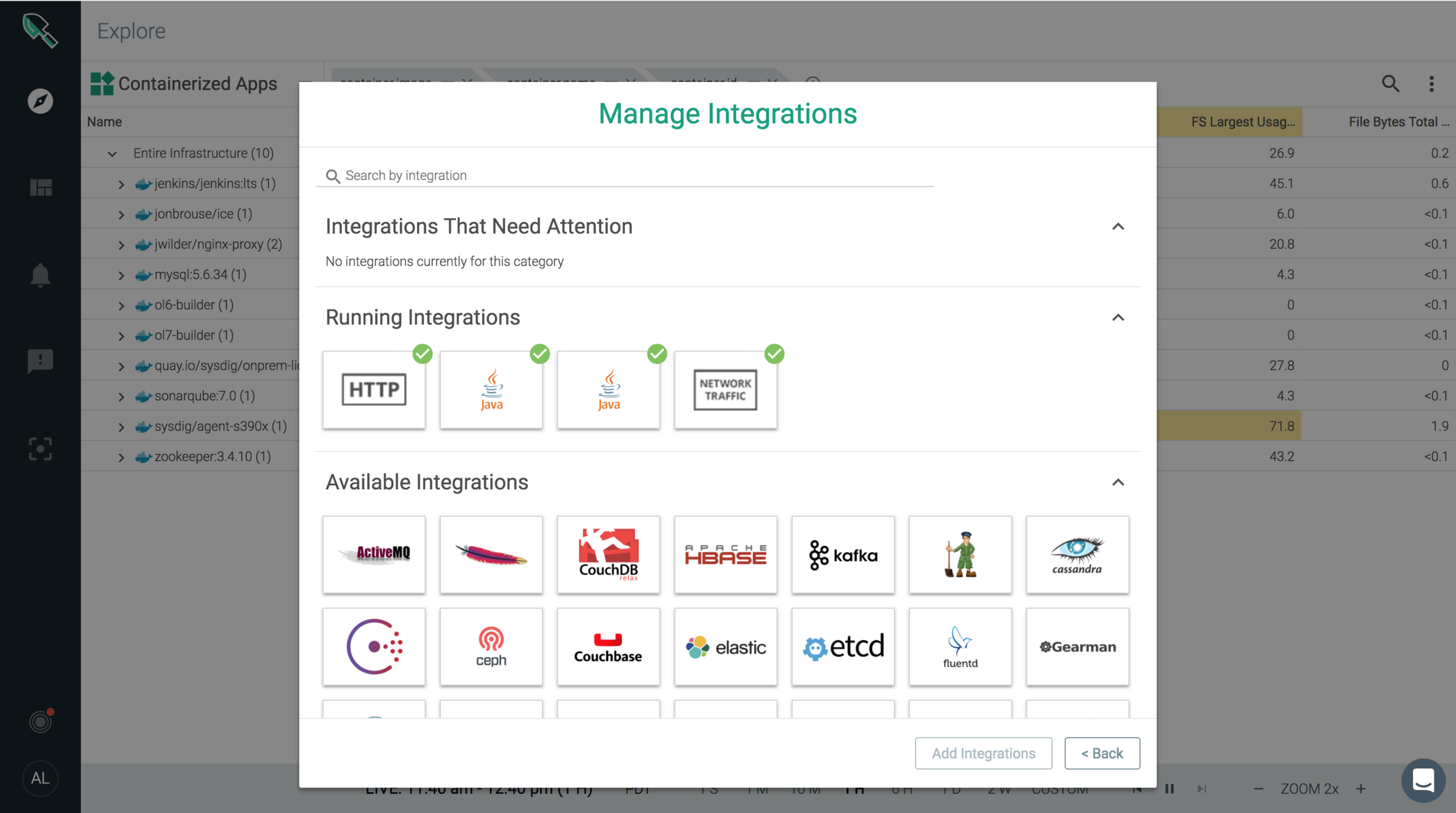
- "What do you mean nothing's there?" Sysdig automatically detects integrations and applications, but if those integrations aren't set up correctly, a first time user is dropped into the product with "No Data Received", ruining first impressions and trust of the product.
- No Post-Installation Transparency: Users had no insight into how their applications and integrations were doing beyond first time set up. In addition, on-premise customers had no idea how many software versions they were behind, making them miss critical feature releases and feature improvements.
- Support Bombardment: Sysdig learned 1/3 of all customer support tickets were related to status problems that users could easily fix themselves--if they only knew there were problems. How could we provide high visibility with low management overhead?
Concepts
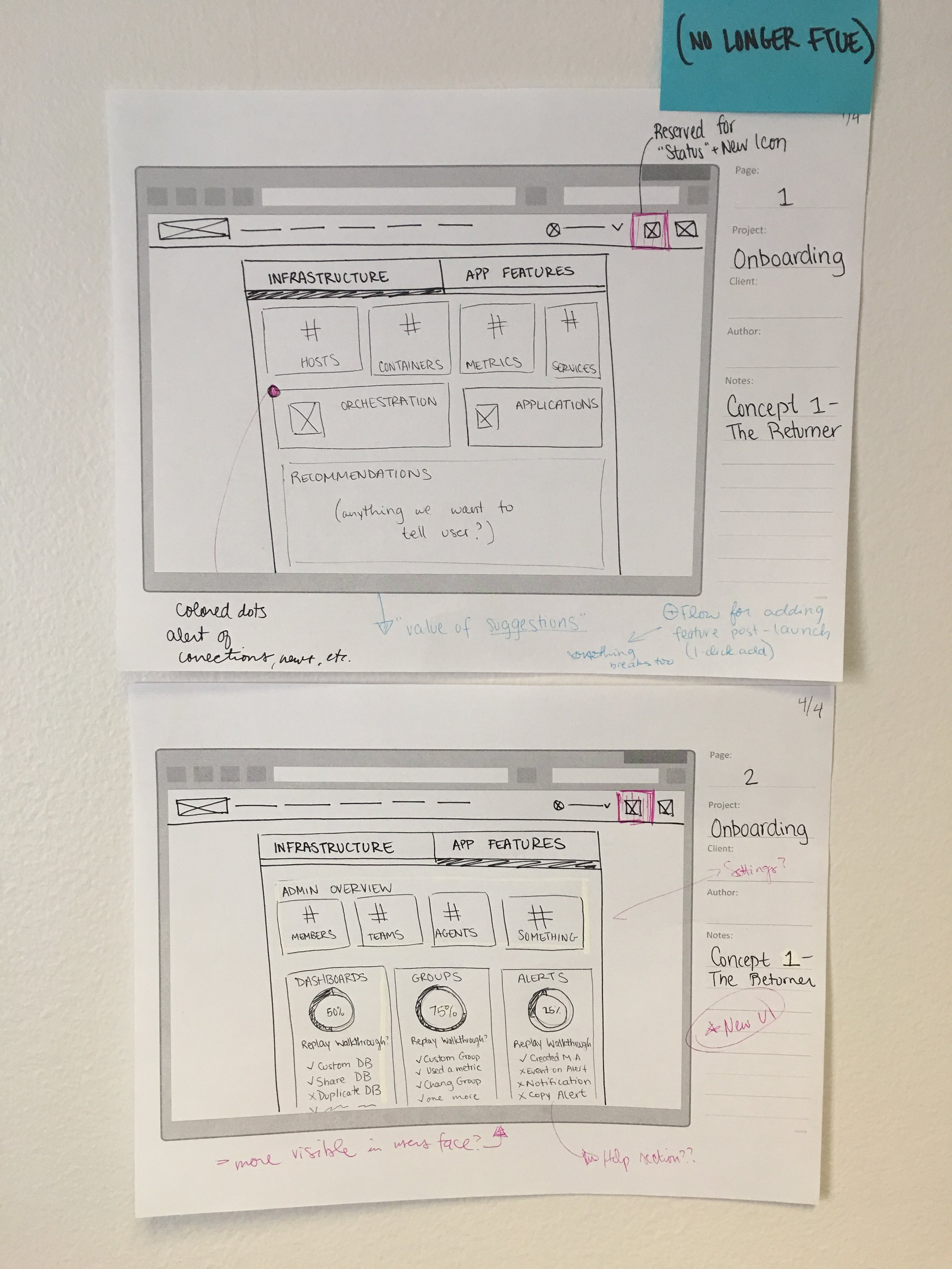
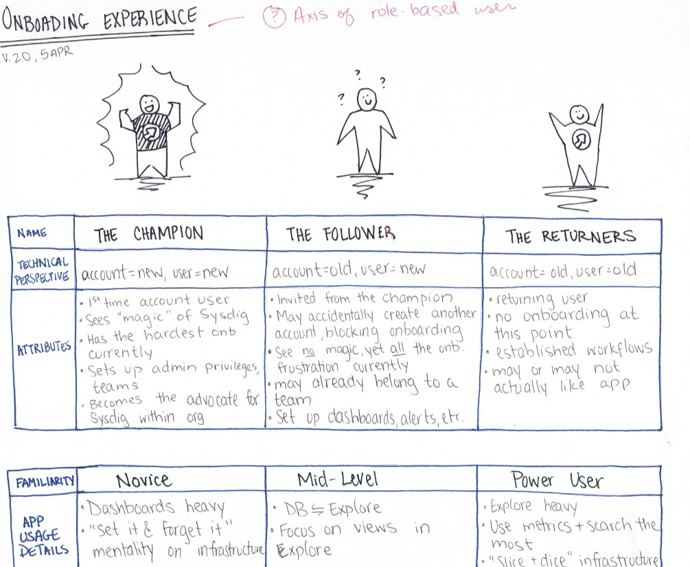
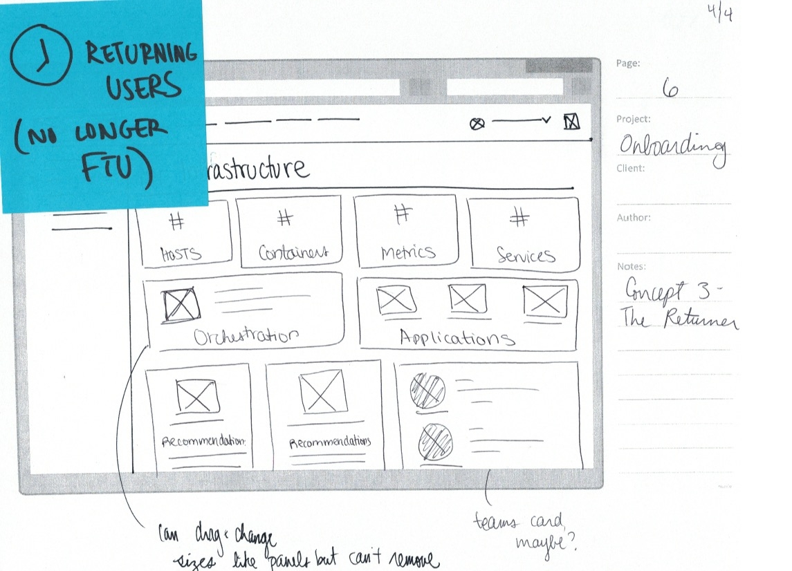
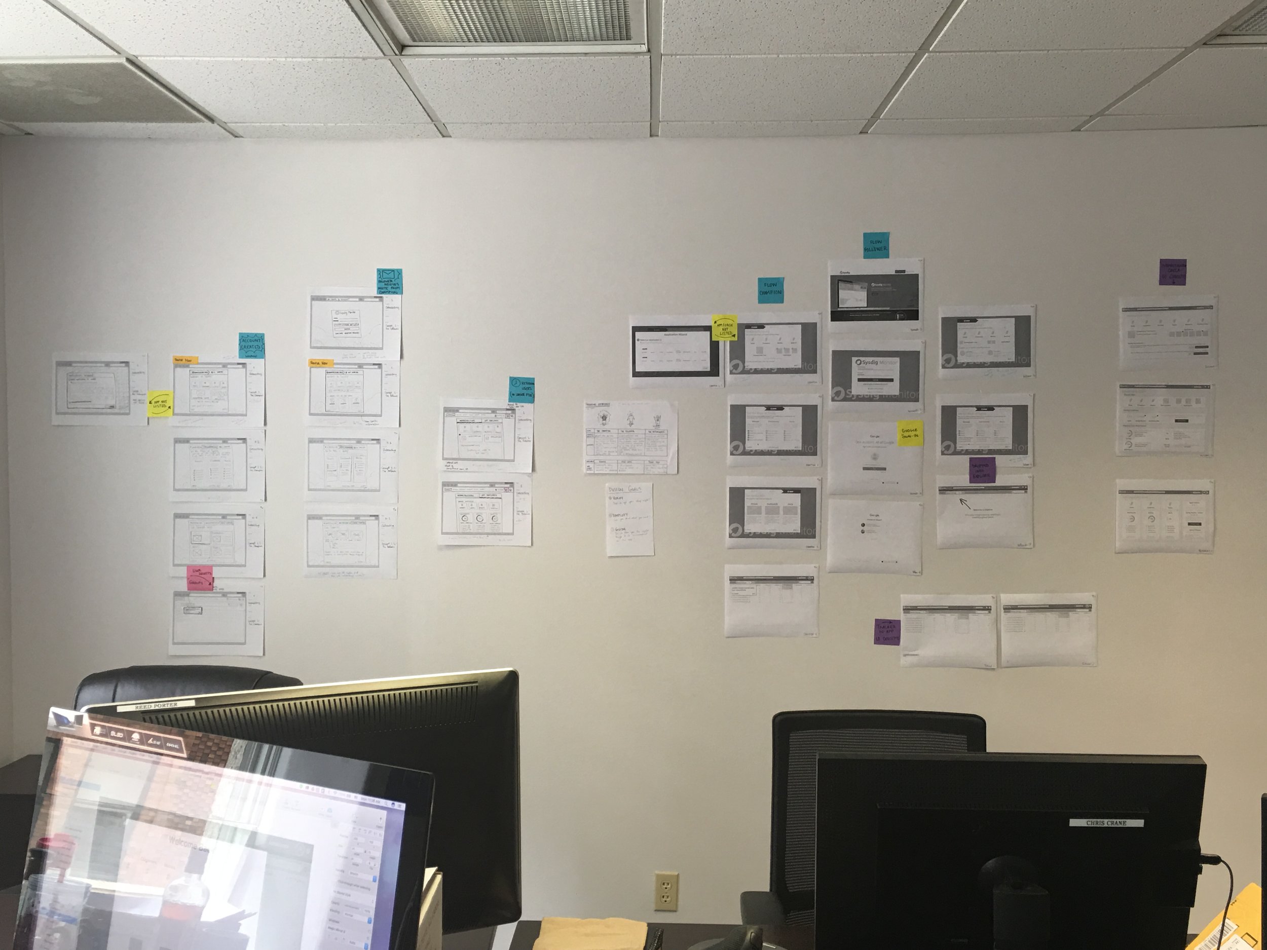
This project was extra special at the time because it was the first feature I designed from the beginning (as opposed to redesigning existing features). As the first product designer of the company, I wanted to stress process, iteration, and getting feedback at multiple points. Based on based customer calls, I created three mini-personas for the project and set out to build a cohesive and consistent experience for all three of them.
Research and Insights
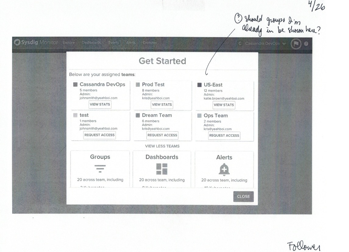
I tested with 3 stakeholders and 2 customers using this Invision prototype. The biggest insights were:
1. This was a feature people were missing: The time saved from this as opposed of sifting through extensive logs was exponential.
2. Balance the amount of data shown per stage.
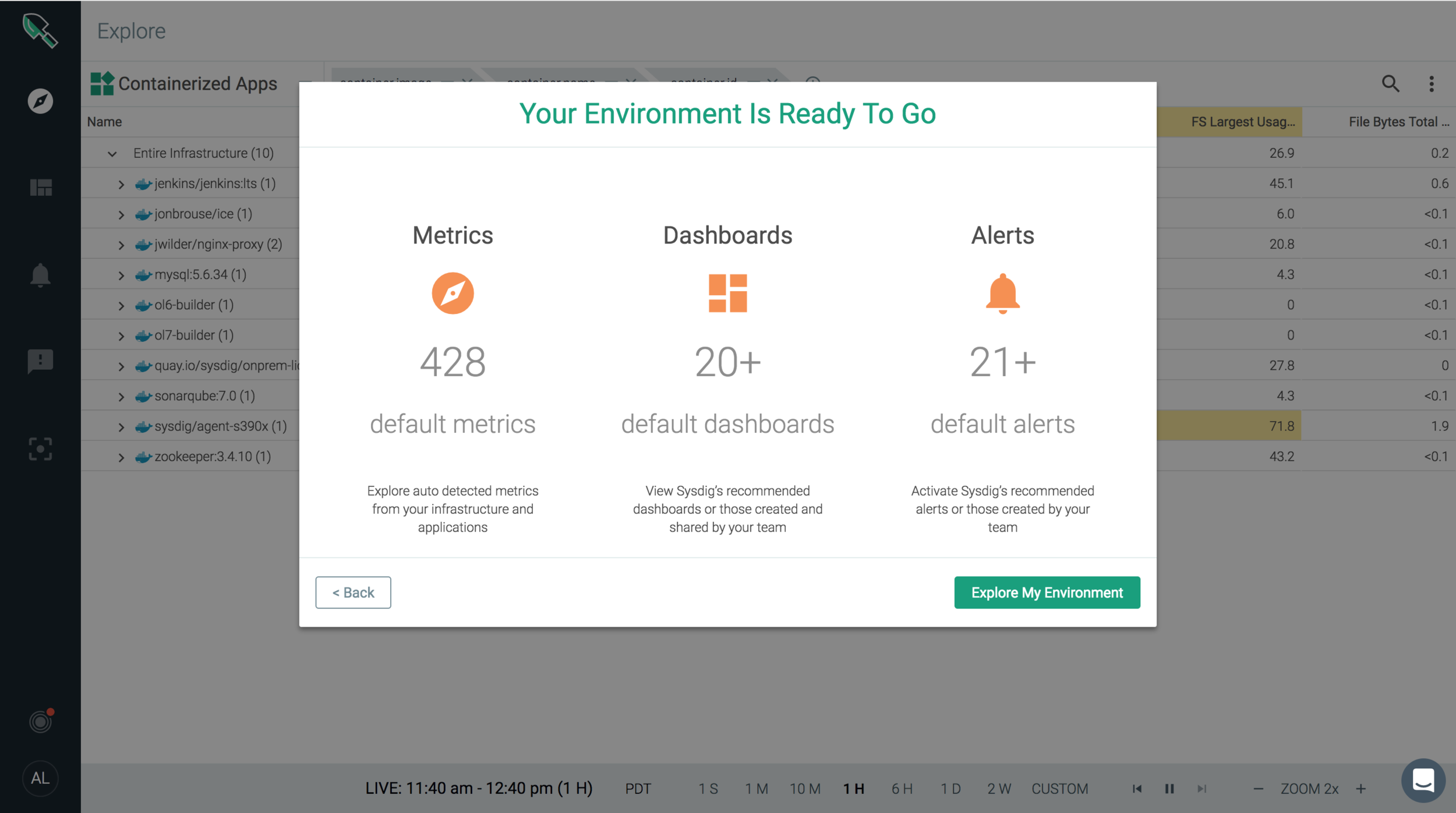
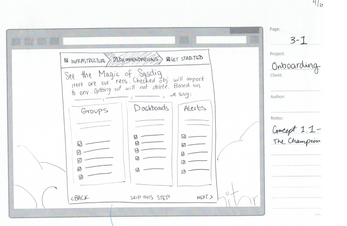
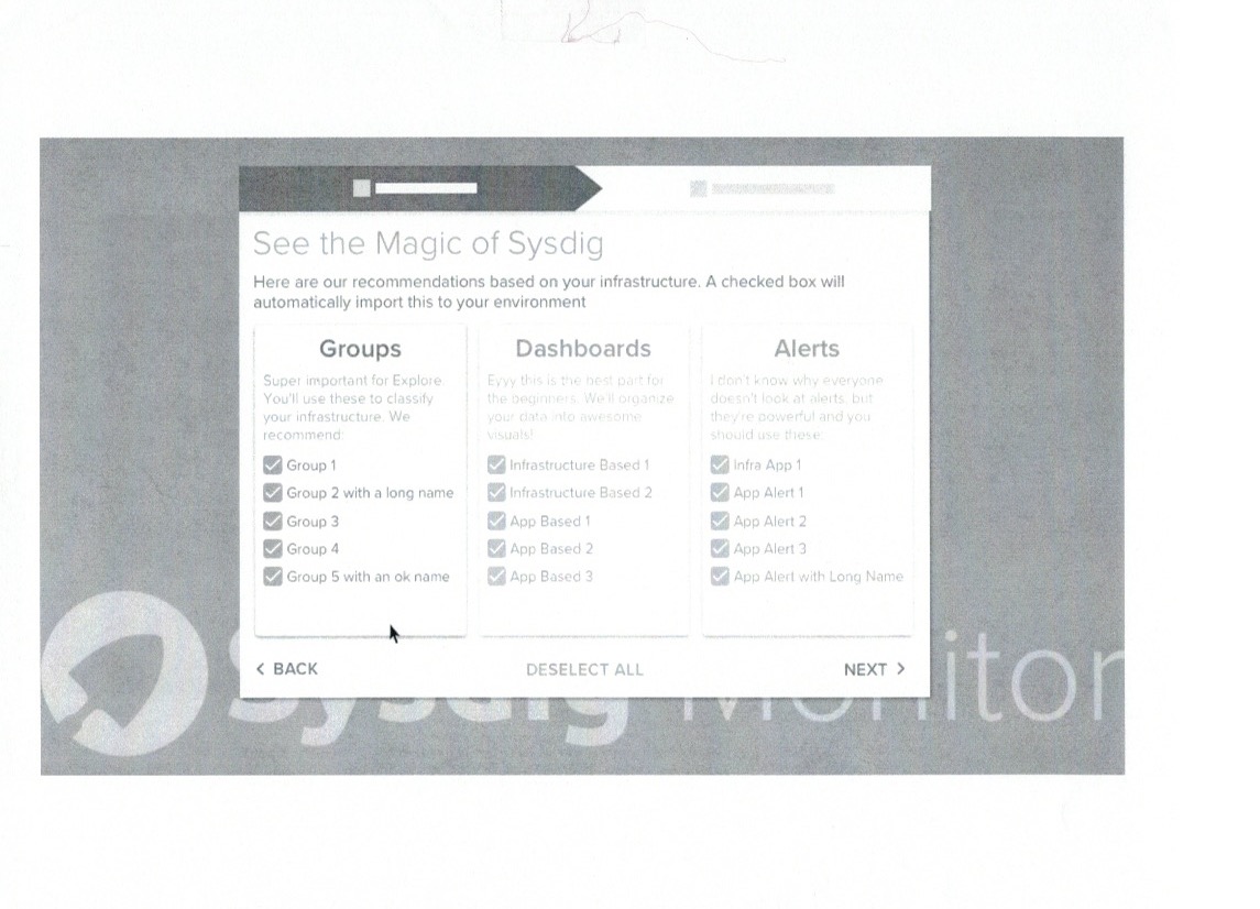
3. Rebuttal of the IKEA effect: In an effort to make users feel like they invested in the product, an initial design had users designate which dashboards and alerts they wanted to create through micro interactions (dropdown menus, checkboxes). While choice can be great for some apps, this failed spectacularly with users.
At the end of the day, and my primary point to stakeholders, was less is more.
USER QUOTES
"This [feature] would have saved us half a month of debugging time. I wish we had this before."
-Enterprise level Admin
--
"I want my team to fix issues, but not update the software; that's dangerous and could ruin parts of my infrastructure, and that causes me more problems in the long run."
-DevOps User
Iterate and Refine
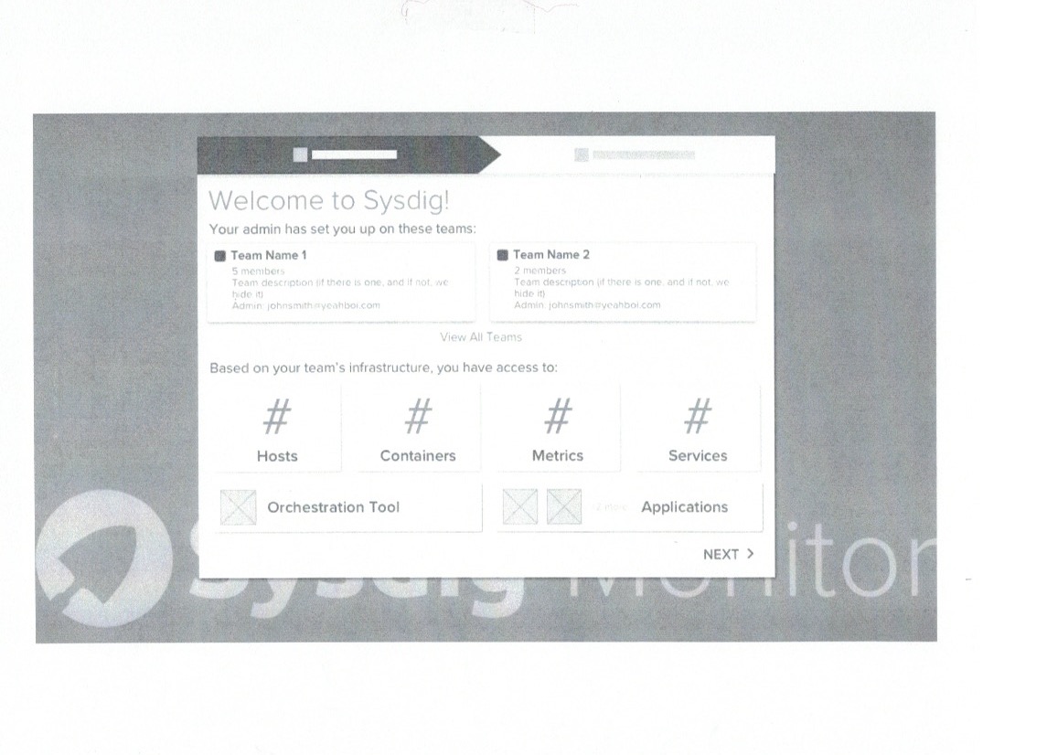
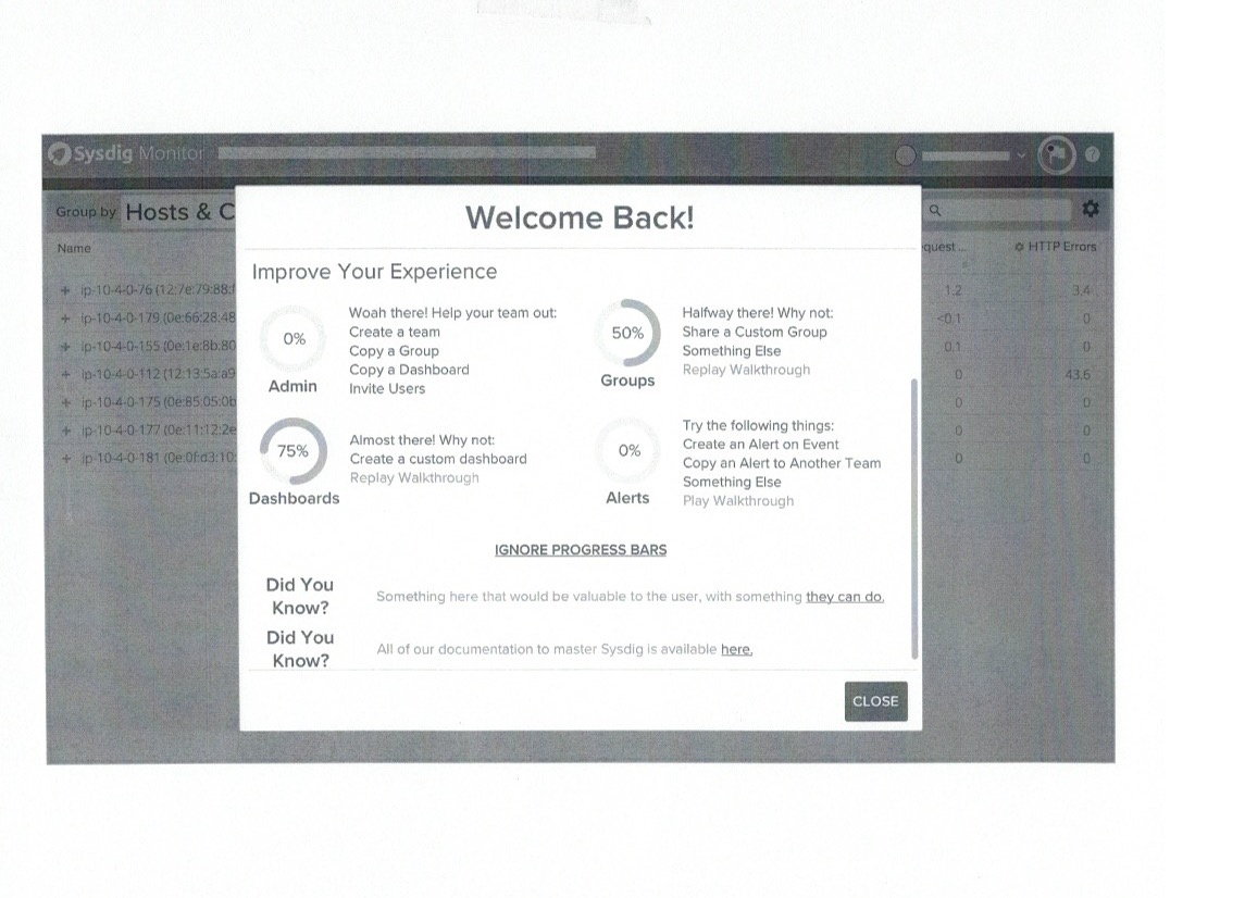
In the spirit of less is more, I streamlined the content and removed unnecessary content such as team selection and microinteractions. Spotlight, the experience for a returning user, was moved into a modal to be consistent with the onboarding experience. I also worked with marketing to craft a blog post that would speak to our mini-personas and accurately describe the feature.
Final Design
Visual design in Spotlight changed because of the application redesign.
Post-Release and Introspection
Spotlight was released March 6th, 2018. In the two months since it was released, 150 users use the feature per week and is clicked 500 times on a weekly basis. Qualitatively, it has received positive feedback.
Data aggregated on weekly basis from Jan-April 2018
In the next iteration, I designed Spotlight to be its own page in the application instead of a modal so the content has more breathing room, is better designed for growth into a notification center, and is more aligned to our new pattern library. In hindsight, I wish I had better championed for a full page to stakeholders more because a page was significantly less development time than a modal. Next time!
Spotlight Redesign Proposal
